I’ve said it before and I’ll say it again wearable technology needs to be thought of as fashion accessories that are smart. I was excited to see what Apple were going to come up with today but I’ve been disappointed. This isn’t appealing to me and it won’t be appealing to the general masses because it’s a chrome blob.
Where’s the creativity? It’s like design has taken a backseat to something that tries to be too functional, is this post Jobs Apple? Trying to pack in features for the sake of packing features.. What happened to the days of old when they would release something entirely new? Where only 1 product version existed without a meaningless naming convention..
The watch’s design is an unoriginal rectangle, recycled curved from the original iPhones with 2 massive buttons on the side that stick out like 2 sore thumbs. The watch’s design leaves something to be desired, it’s like Jony Ive has taken a sabbatical.
These features are nothing more than gimmicks
- Learning a new interaction paradigm using the digital crown button
- The other button
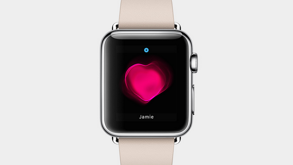
- Sketch, Walkie-Talkie, Tap & Heartbeat are just gimmick apps in the unlikely event that 2 people have Apple Watch
- A host of apps such as calendar, maps, photos and passbook which is confusing since you’ll need to have your phone anyway
I’ll end it on a good note, there are some interesting features such as ….
- It’s clever enough to distinguish between moving, exercising and standing cleverly bundled into basic fitness tracking
- Apple Pay is available on the Watch, great and convenient although authentication is a mystery at this point since authentication is done via Touch ID on the iPhone
- Apps
- Siri
- Notifications
- Heart rate sensor & accelerometer
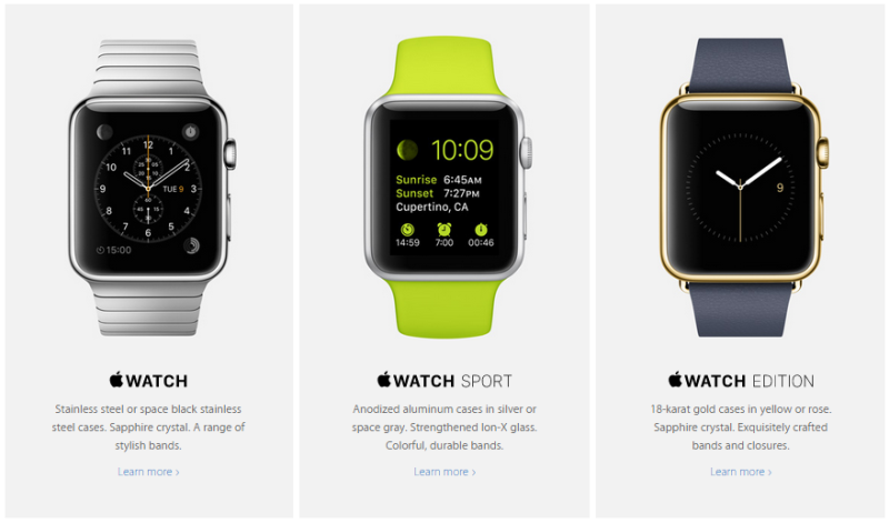
Starting at $349USD from early 2015 with 3 editions that offer no real differentiation apart from price.
What are your thoughts?
